
Lunar Sol Chocolate Packaging
PACKAGING DESIGN | BRANDING

Overview
Lunar Sol is a series of two chocolate bar package designs.
Scope
A five week project with the goal of designing chocolate packaging that reflects the brand's identity, enhances the user experience, and meets production standards.
Role
Branding
Product Designer
Graphic Designer
Adobe Illustrator
Rhino3D
Date
Mar - Apr 2025
Tools
Background
I was tasked with researching, developing a concept, and prototyping in order to create two print ready designs that balances aesthetics and functionality, resulting in packaging that appeals to consumers.
Some tidbits of my thoughts
This was my second time working on packaging design, and something I wanted to explore further from my previous experience was the use of color and how the products function as a series.
Research
Initial Research
My theme for the chocolate brand was day/night theme. I wanted it to be simple, playful, and feel connected to nature.

Visual Research
I liked chocolate packaging that had some pattern to it as well as chocolates that matched the packaging.
The initial idea came from being a night owl myself and considering the contrast and harmony between day and night.
Concept

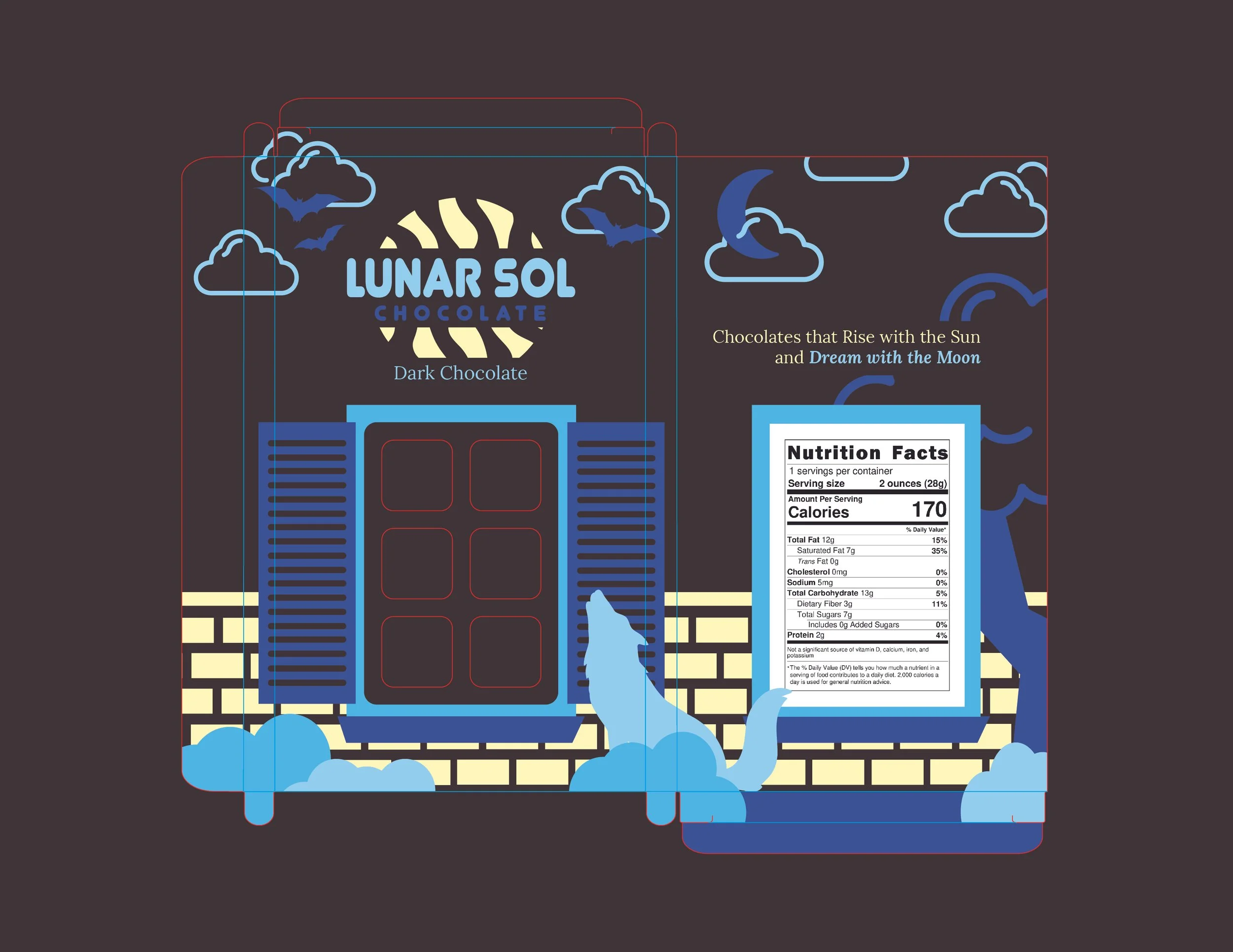
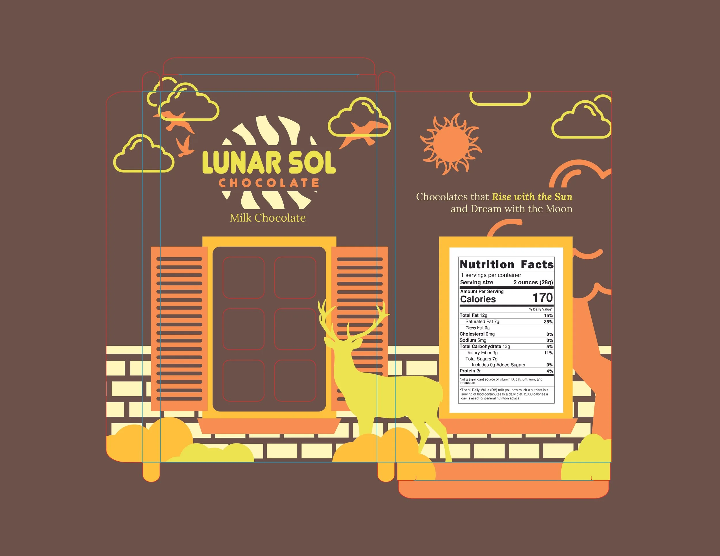
Lunar Sol is a chocolate duo that celebrates the harmony of day and night—milk chocolate that rises with the sun and dark chocolate that dreams with the moon.
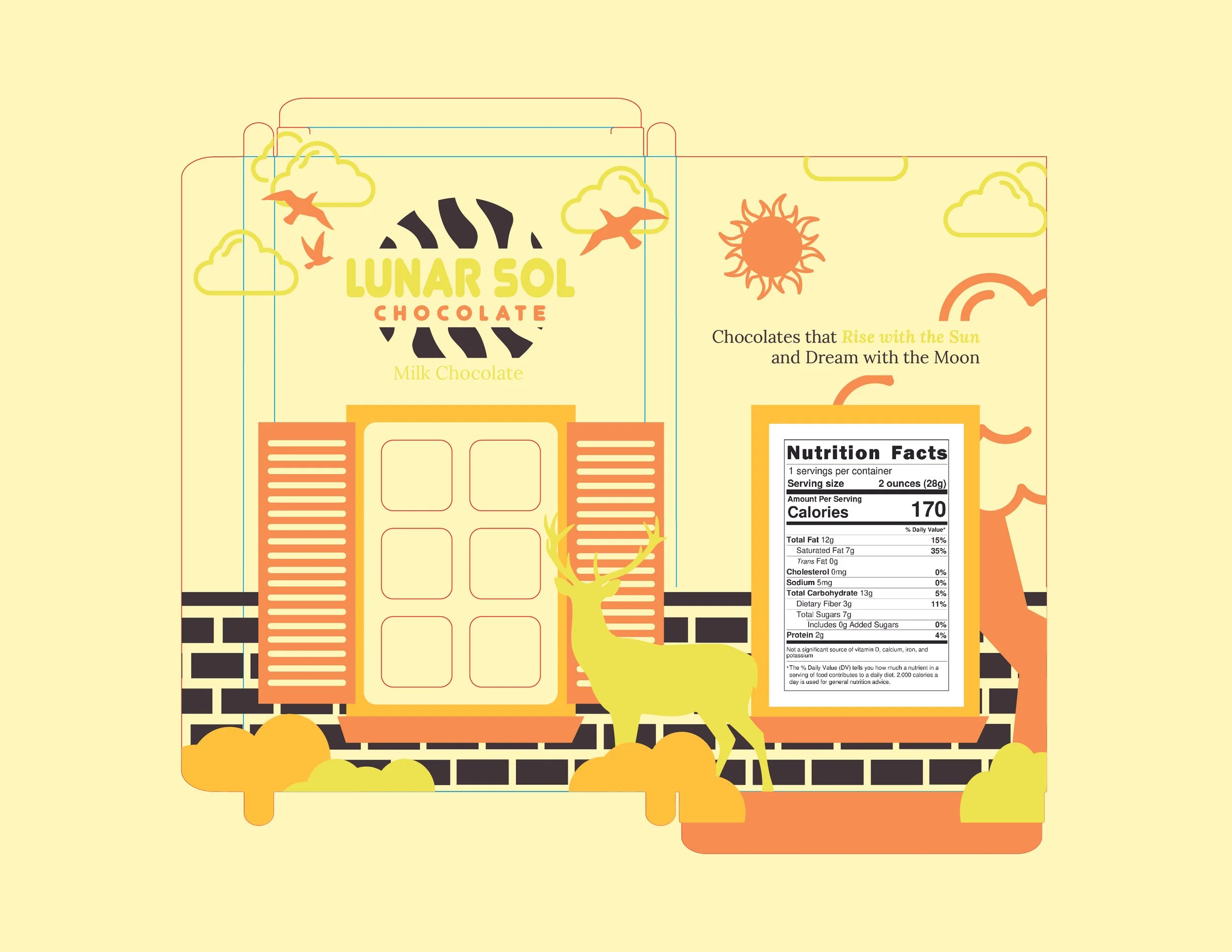
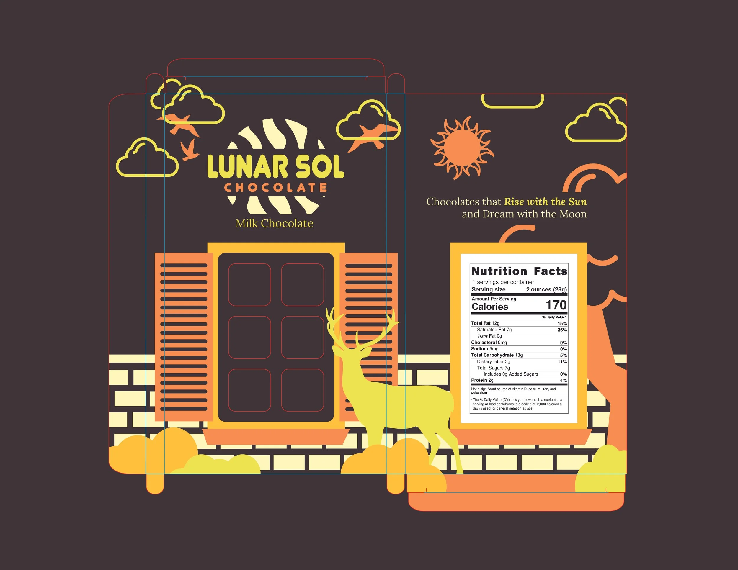
I wanted to ground my packaging in a consistent setting and incorporate a window detail as a main feature.
Design Development
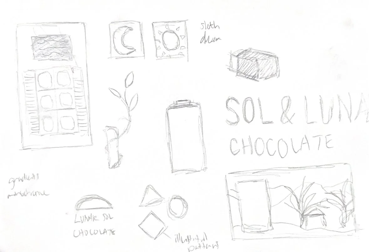
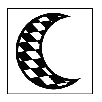
At this point I had not decided on the packaging format. I was trying to explore potential visual motifs or illustrations that could be used on the chocolate or packaging.
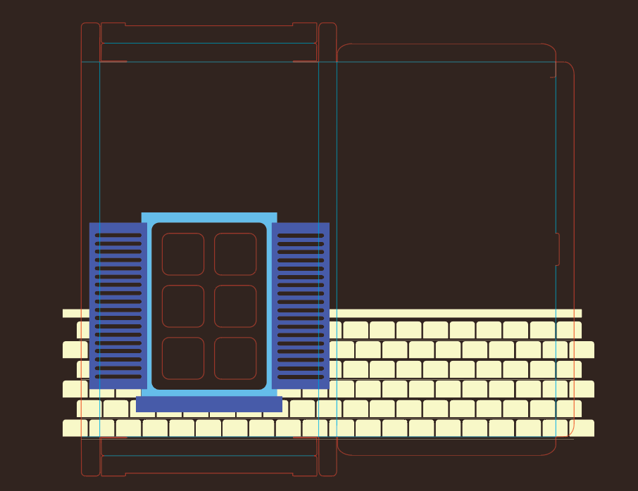
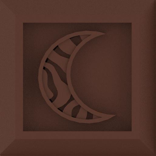
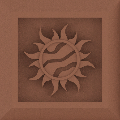
I started with making a template for a window cutout where people could see the chocolate inside.
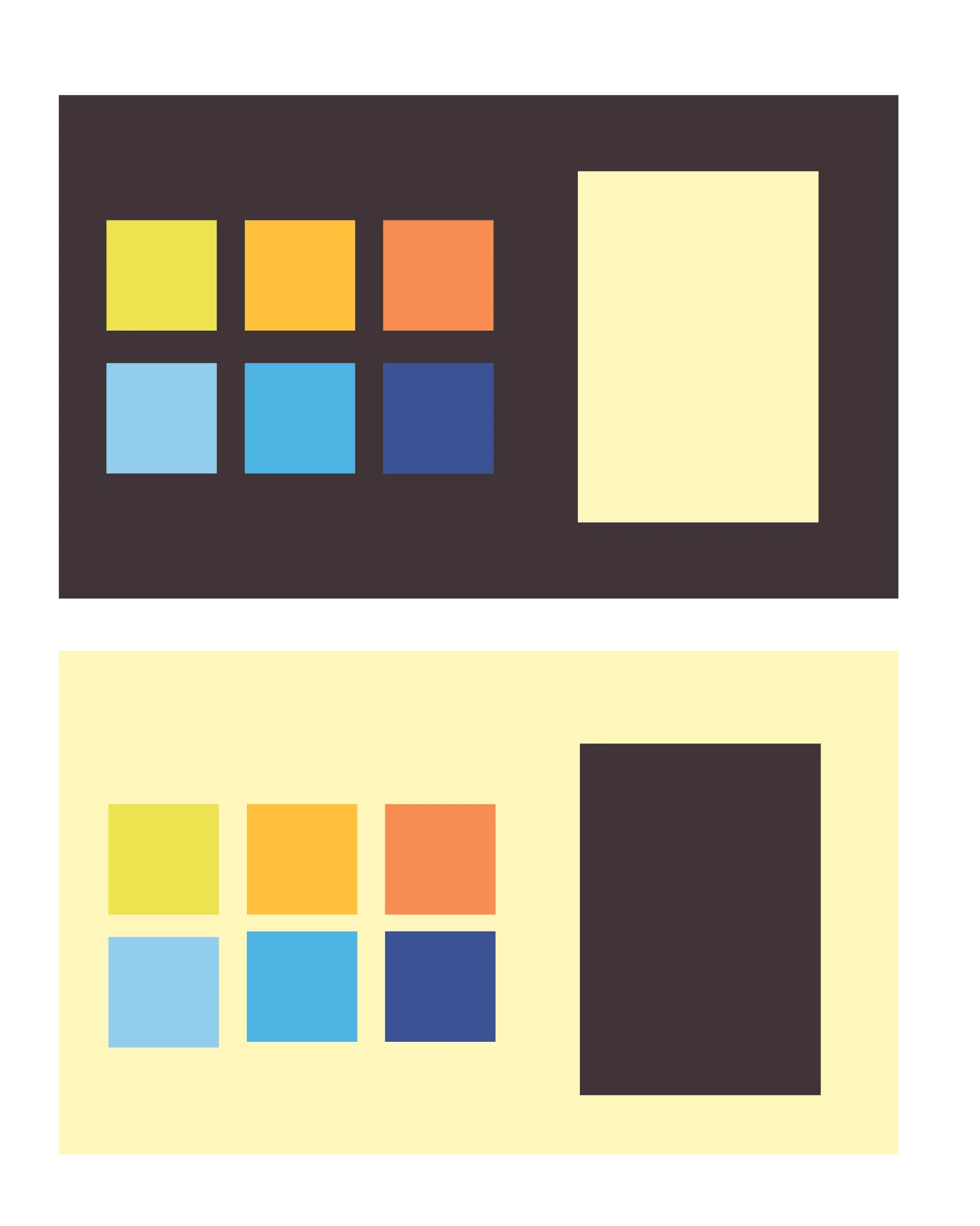
I wanted a color palette that distinguished the two designs but still had good contrast.
This was my initial pattern, but I changed it to a more abstract curved pattern after deciding the initial pattern did not feel aligned with the 'natural' concept.
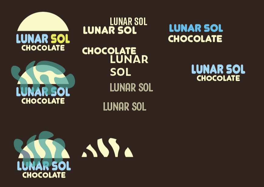
Typography and Logo exploration
Design Strategy
I designed the packaging and chocolate bars in tandem with one another so that after printing both out they would seamlessly work together to create a cohesive unit.
My philosophy with packaging is transparency; I believe users should be able to see the product.

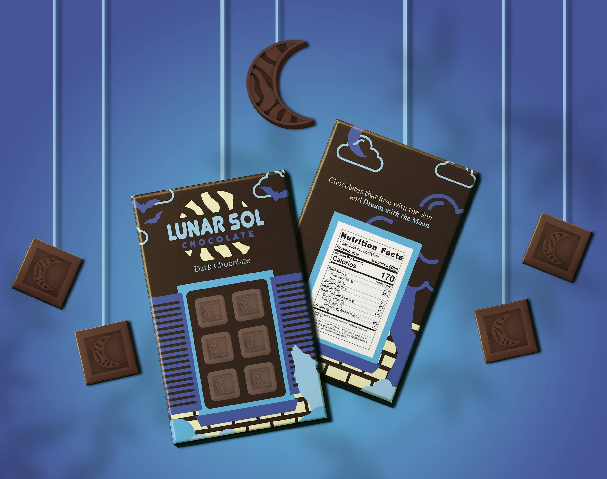
Day Chocolate Packaging
I experimented with different color schemes for the day packaging. My initial plan was to do the lighter background, but it clashed with the yellow color scheme. The dark background worked with the yellow color scheme but did not align with the day theme. Ultimately, I went with a warm brown to complement the bright shades of yellow/orange.
Final Products
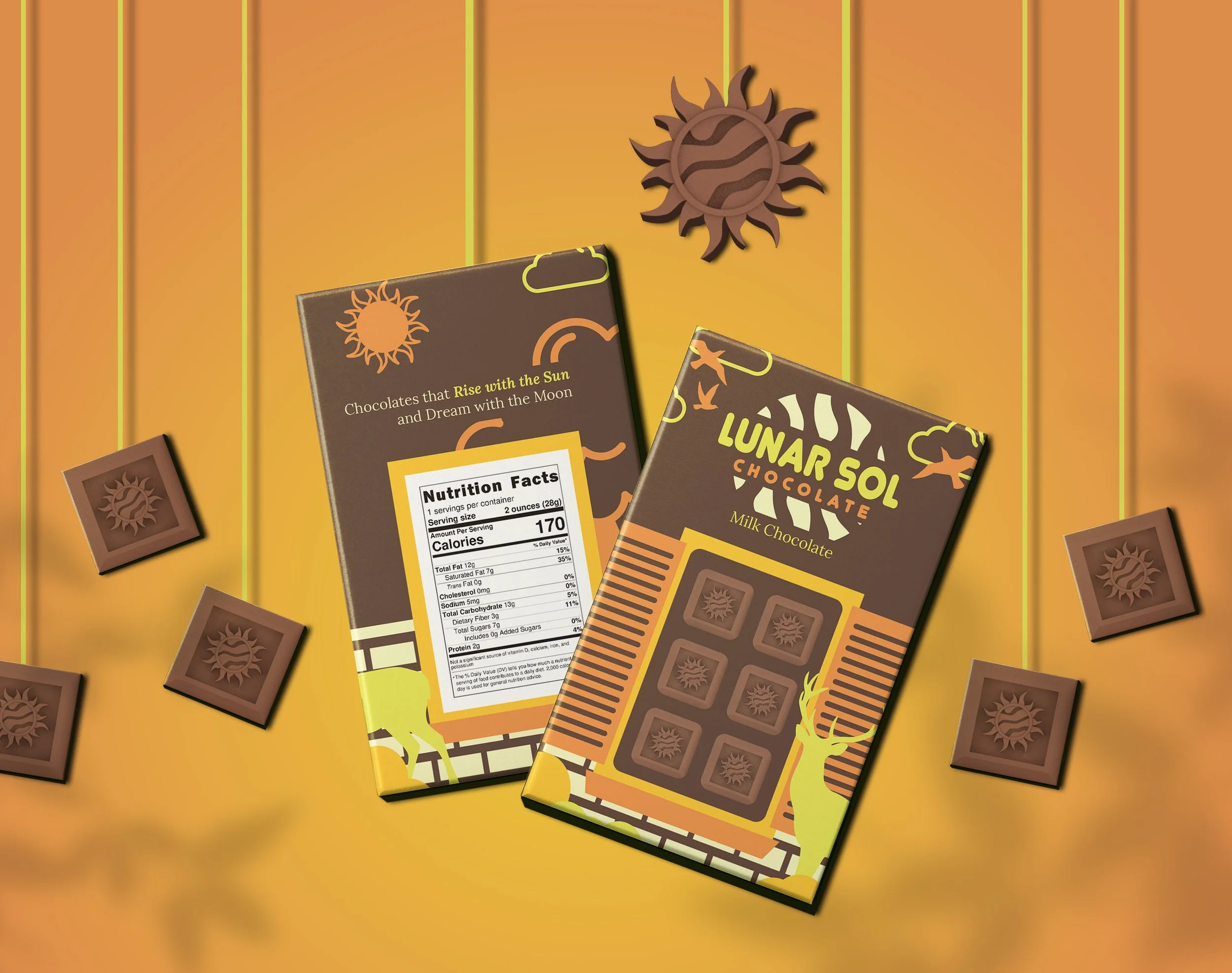
Lunar Sol Collection
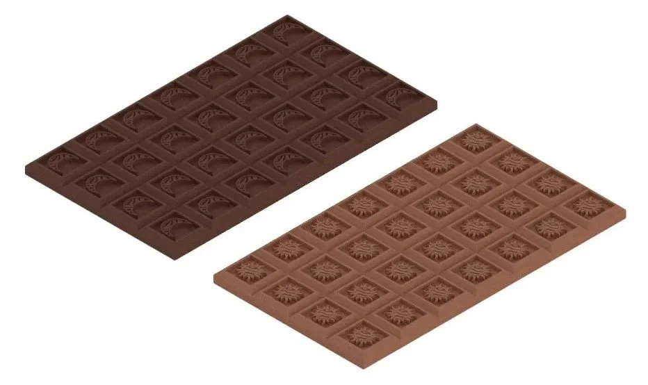
Final mockups of the two chocolate bar package designs, showcasing the interplay of the richly colored packaging with their respective moon/sun chocolate designs.
I made these mockups and pictured them working well in print media such as magazines as well as in various forms of digital media.
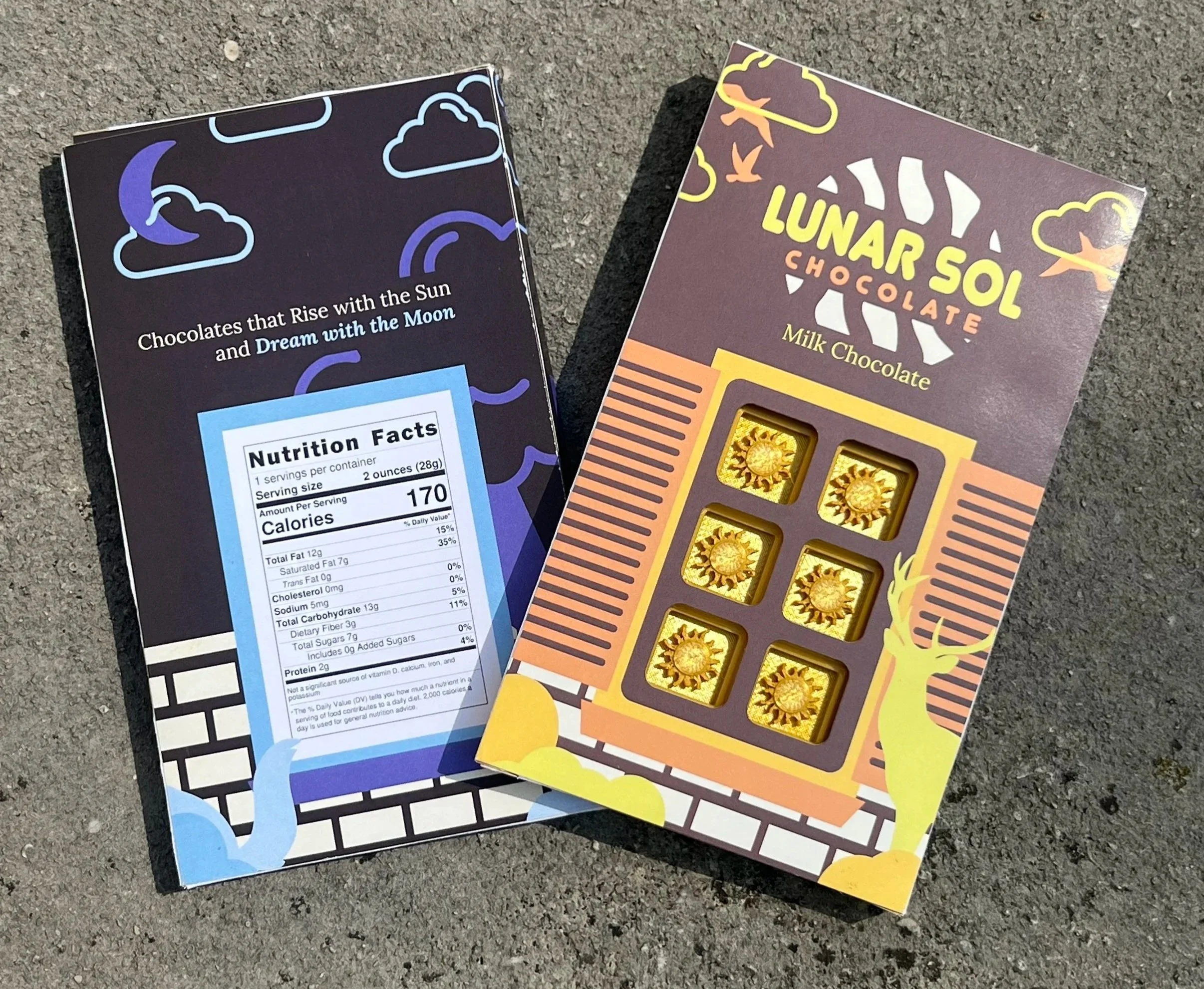
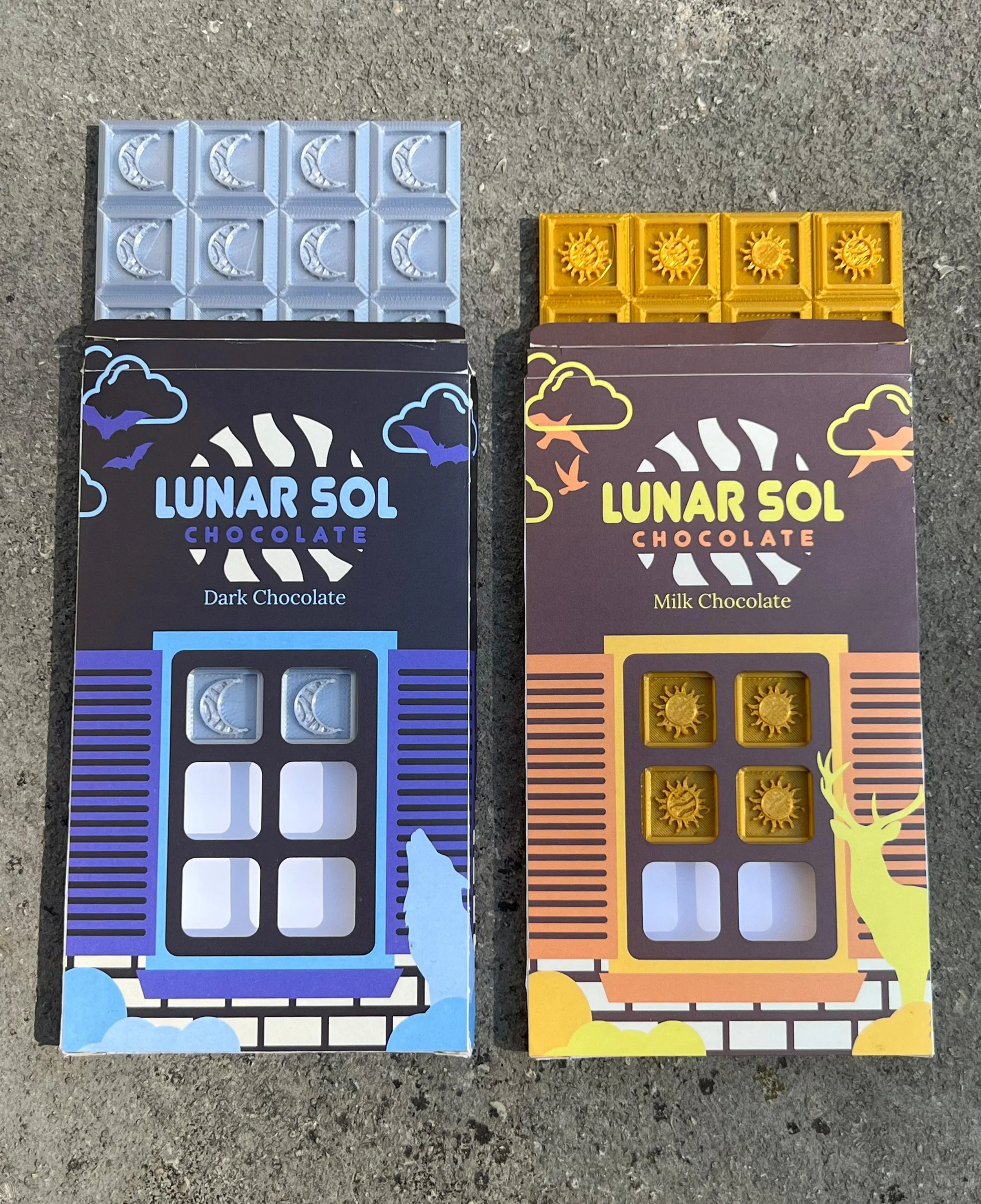
Lunar Sol Physical Products
Physical versions of the packaging that measure 5.5” x 3.15’’. Through the printing process I got a better sense for how the design worked together from all sides as well how the chocolate aligned with the packaging.
For the physical prototypes I went with silver and gold chocolates to experiment with the look of uniquely colored chocolate that would contrast with the packaging.
Chocolate Designs
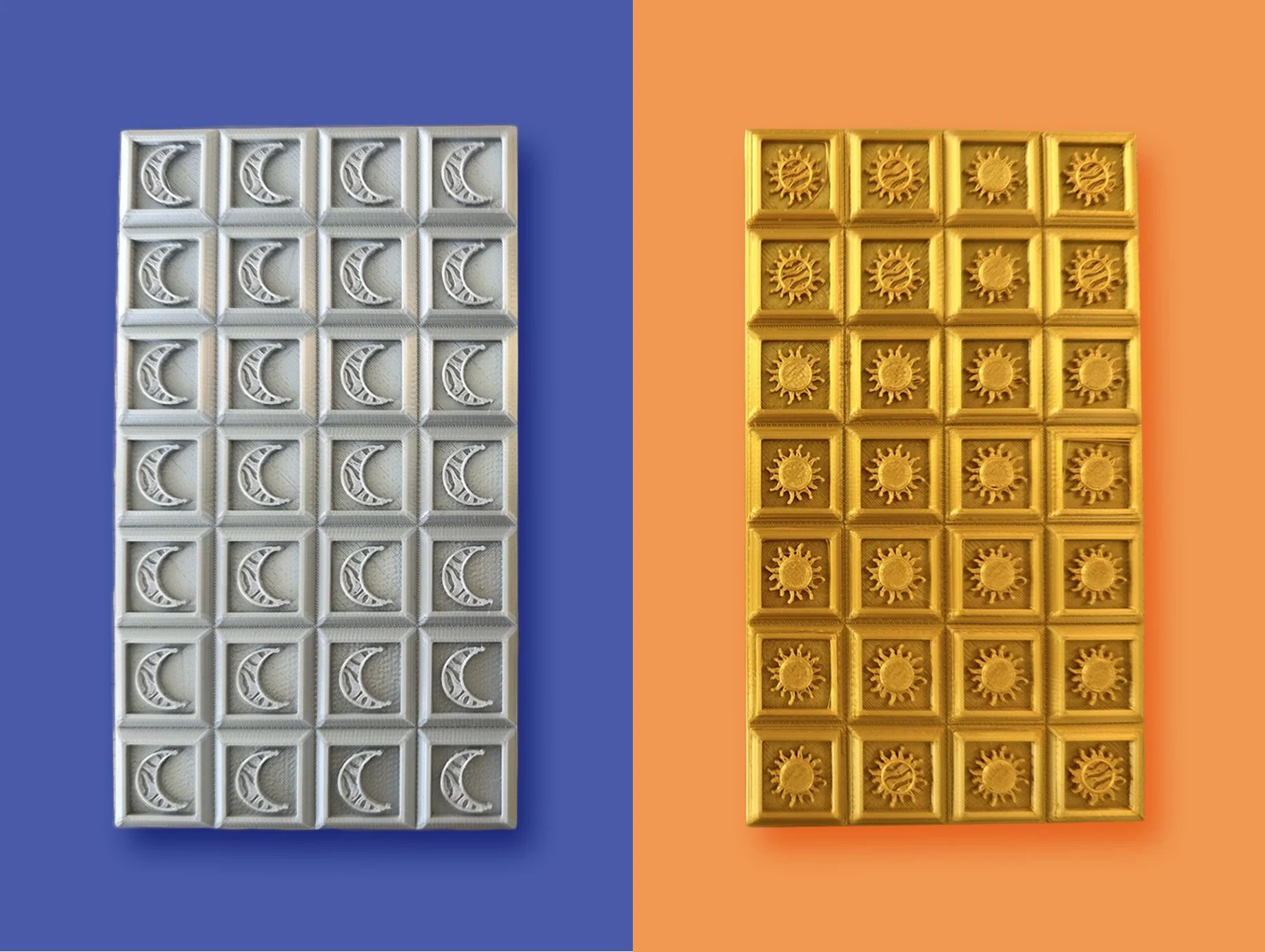
PLA 3D prints of chocolate bars, which were designed in Rhino3D.
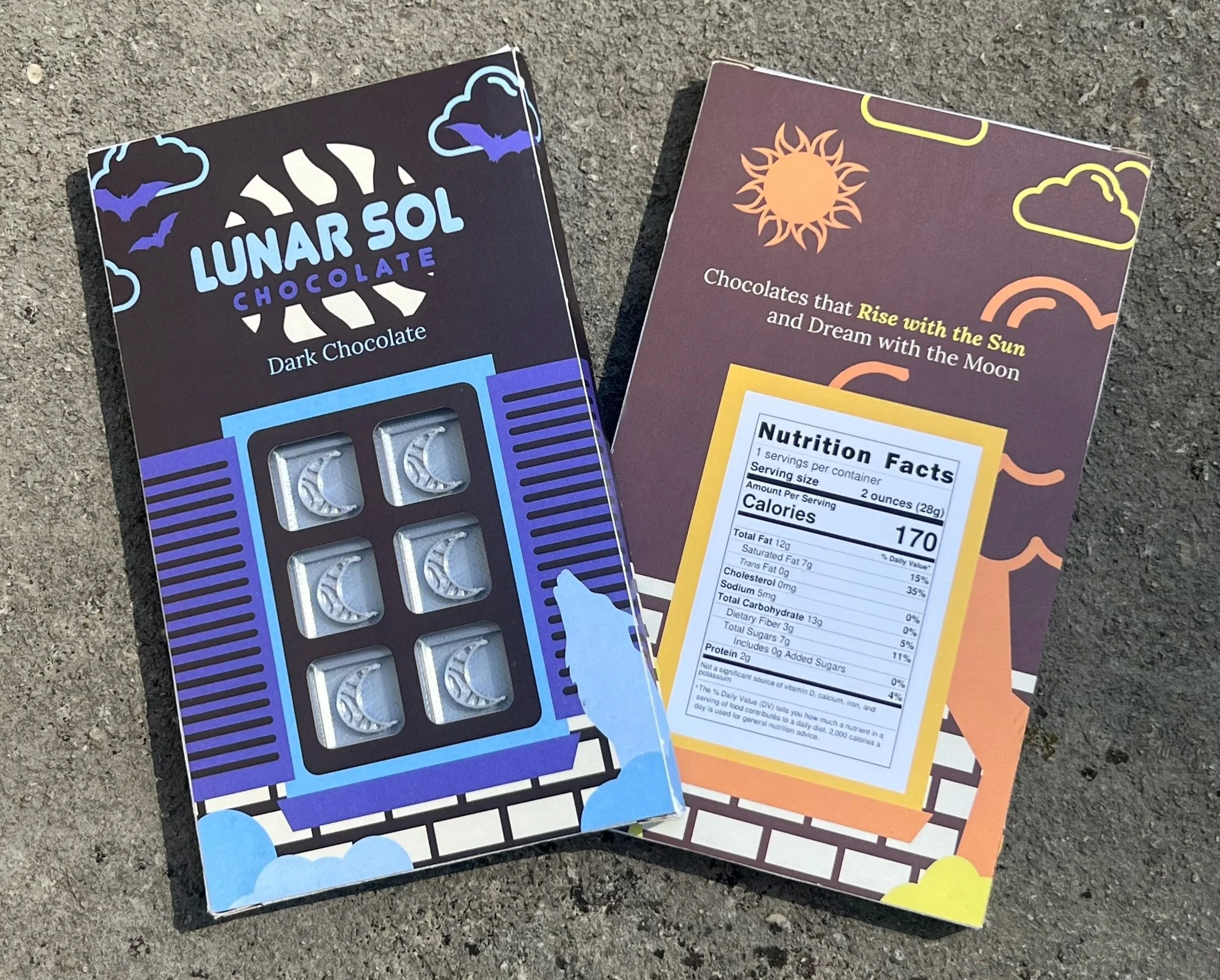
Lunar Sol Collection - Final Designs

The final chocolate bar designs uses motifs of day and night in one cohesive series. The Lunar Sol chocolate collection blends day and night into a playful, nature-inspired chocolate experience for consumers to enjoy day, night, or any time in between.
Results
I enjoyed the creative freedom and merging of my branding, graphic design, 3D printing skills into a series of final products. This project taught me the importance of designing with production in mind—creating something physical requires different considerations than designing for digital interfaces alone. My concept was inspired by the contrast between night and day, and evolved through experimentation with patterns, illustration, and branding elements. If I revisited this project, I’d push the design further by adding more realistic packaging details.
Sampling different chocolates and analyzing their respective packaging was definitely a highlight of the research process!