
Tote Collection for Eskenazi Museum of Art
VISUAL DESIGN | BRANDING

Overview
The Eskenazi Museum of Art has a gift shop located in the middle of Indiana University’s campus, welcoming students, Bloomington locals, and visitors alike.
Scope
A six-week, partially group-based project in collaboration with representatives from the Eskenazi Museum of Art, aimed at applying our graphic design skills to create gift shop items that reflect the institution’s identity and engage its audience.
***Link Everything, Change description in title card
Role
Researcher
Graphic Designer
Branding
Date
Feb - Mar 2025
Client
Eskenazi Museum of Art
Tools
Adobe Illustrator
Adobe Photoshop
Background
I was tasked with designing functional, visually compelling products based on insights from my research and meetings with museum representatives.
During our initial meeting they told us a bit about what they were looking for including the following:
Preference towards references to the museums architecture
The logistics and cost of producing an item
Parameters around what could or could not be used (i.e.. copyright on artworks or things belonging to the University)
Research and concept were conducted in groups, but designs were produced individually. The museums representatives would chose 2 designs to actually manufacture.
Some tidbits of my thoughts
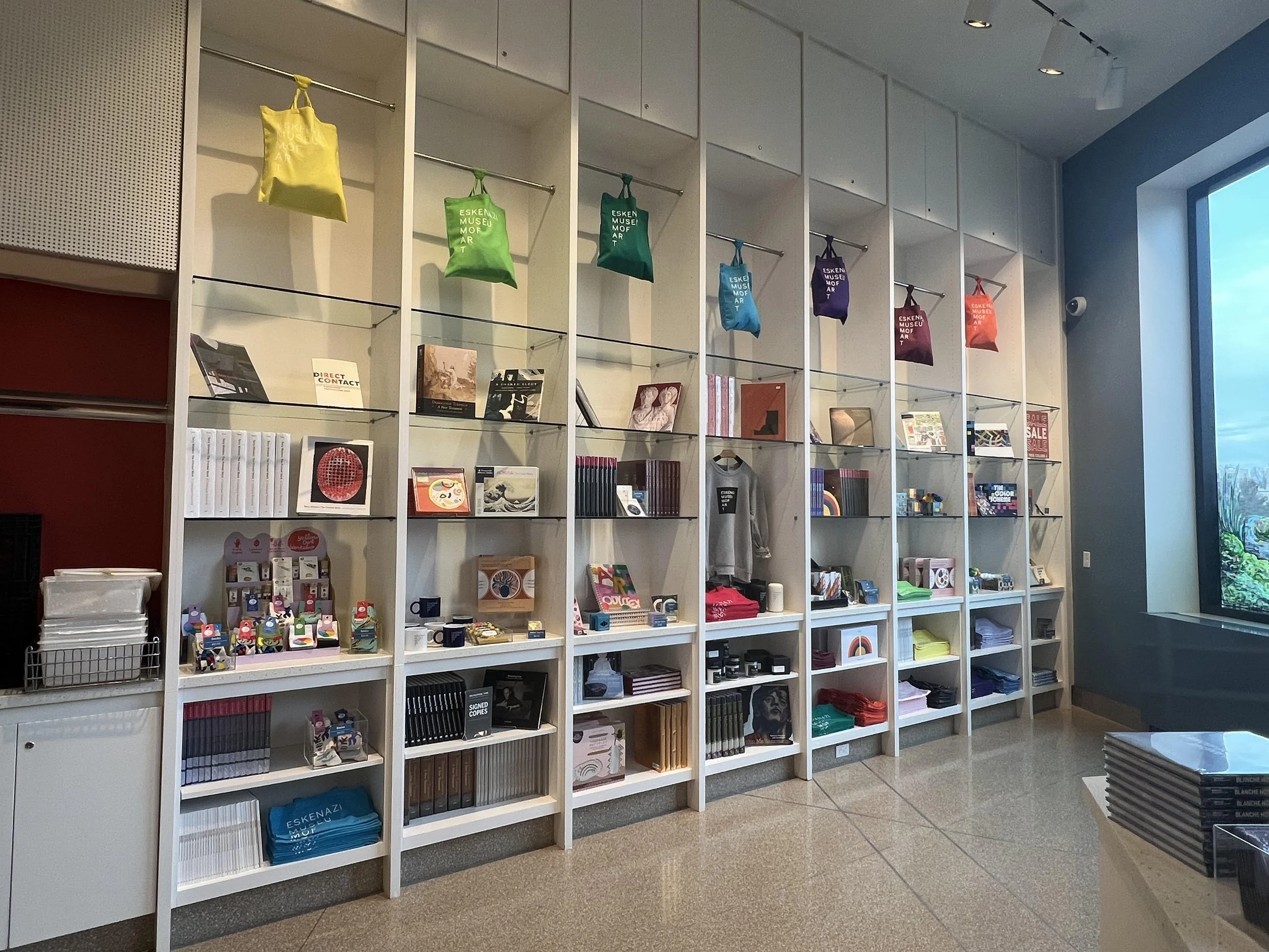
The gift shop had a good variety of items including books, postcards, stationary, t-shirts, and bags. However, I felt there were very few products (if any) that had a unique identity to the Eskenazi Museum itself.
Research
Initial Research
I started with ‘What museum gift shop products exist and what makes them successful?’ as a driving questions. The definition I came up with to answer these questions is that any object that reflects the artworks or museum that resonates with the audience is what I considered successful.

Visual Research
Taking inspiration from museum gift shops I had been to, I looked online at products to get a better sense of ways to approach capturing the spirit of a museum within a design.
I liked products that were a reference to the museum’s works without being exact replicas of objects or artworks within the museum.

Site Visit
Upon visiting the Eskenazi Gift shop I brainstormed products or themes that could be developed for the gift shop including:
Stationary, coffee mugs, keychains, magnets, postcards
Name identity (Eskenazi), architecture references, triangular forms
The museum already had some of these items such as tote bags and postcards.
All of these products seem to have a feeling as if you are able to take a little slice of the art home with you.
In the case of the tote bags, they did not reflect much identity related to the Museum besides saying ‘Eskenazi Museum of Art’ and vaguely forming a triangular shape.
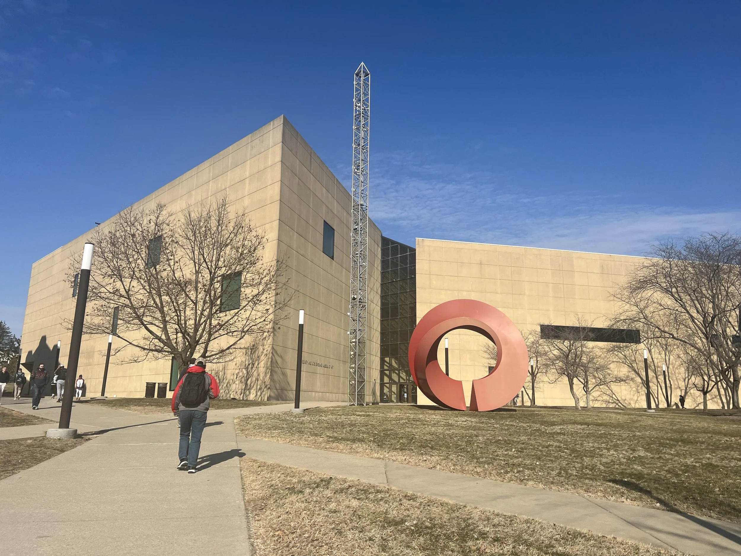
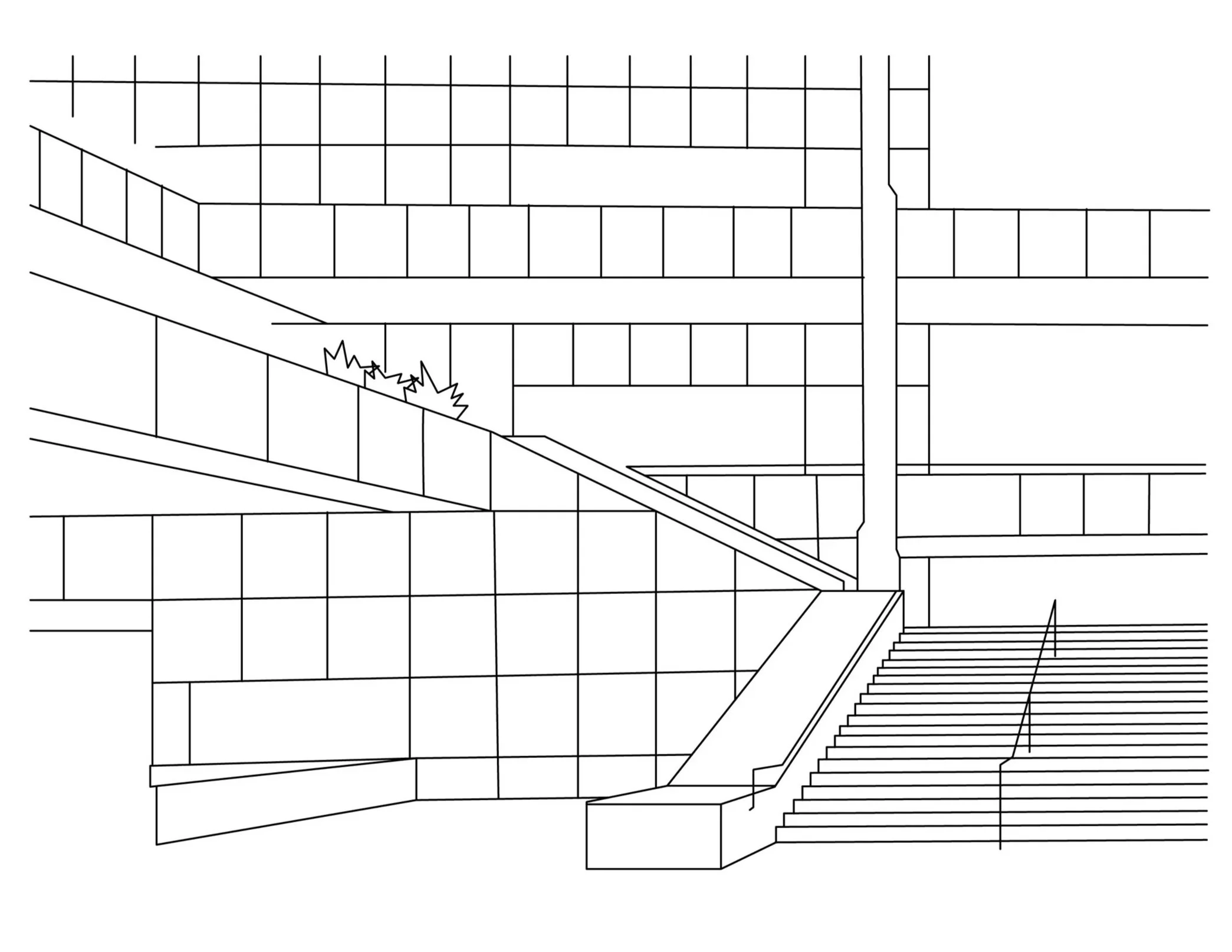
Photo Credit: Brad Feinknopf, Susan Rodriguez
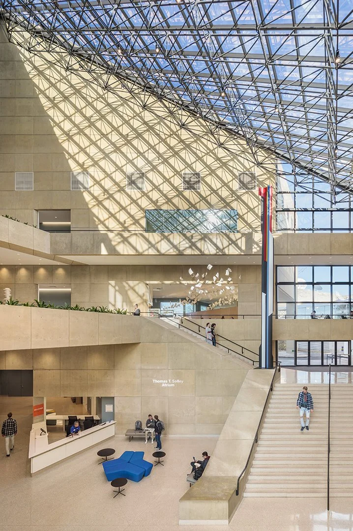
Photo Credit: Brad Feinknopf, Susan Rodriguez
Concept and Inspiration
Initial Concept
We want to capture the unique architecture of the Eskenazi Museum of Art and create a series of posters or tote bags. The designs will capture the essence of the geometric forms of the museums. We hope to incorporate bold typography and eye catching designs to appeal to Indiana University college students and other visitors.
Museum Architecture
The Eskenazi Museum of Art features triangles as a signature motif throughout the building. It is apparent in not only the luminous glass ceiling, but also in other parts of the museum such as the floor plan and grounds of the exterior.
We narrowed our items down to posters or tote bags because we were aiming for products that were easy to produce but also ones that would be good blank canvases for our design.
Design Development
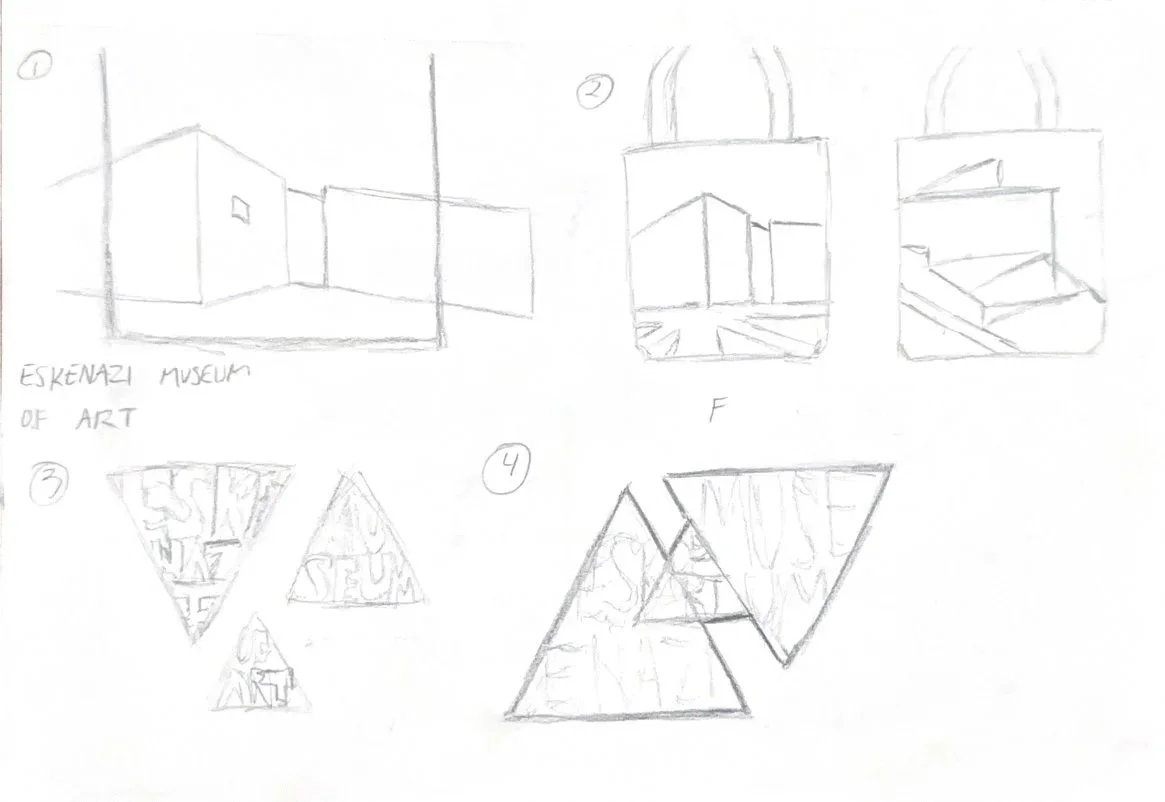
Initial Sketches
At this point, my group had not yet decided exactly on the product we aimed to produce. I chose to focus on visual motifs, typography, and designs that could be transformed based on the product we chose to produce.
I considered a double sided tote bag but left that idea due to trying to keep production costs down for the museum.
Initial Design
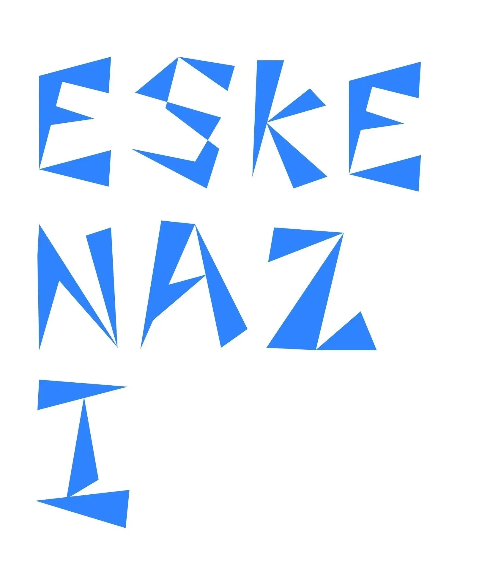
I was inspired by the vast interior of the art museum and also started to play around with triangular letterforms. This is a loose rough draft of two of my ideas.
I was debating between going with a more of a architectural direction or a typographical direction, so I decided to explore both options.
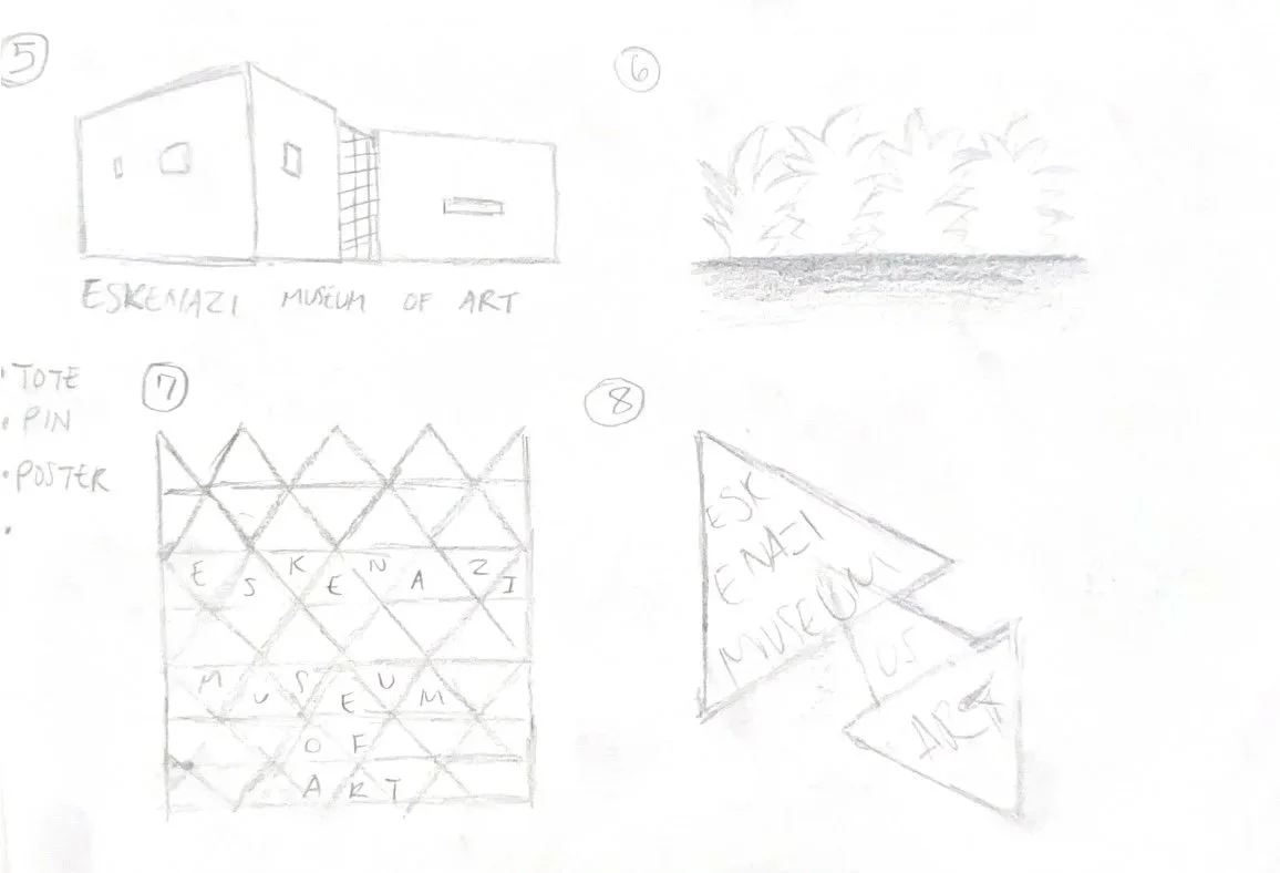
Interior and Typography
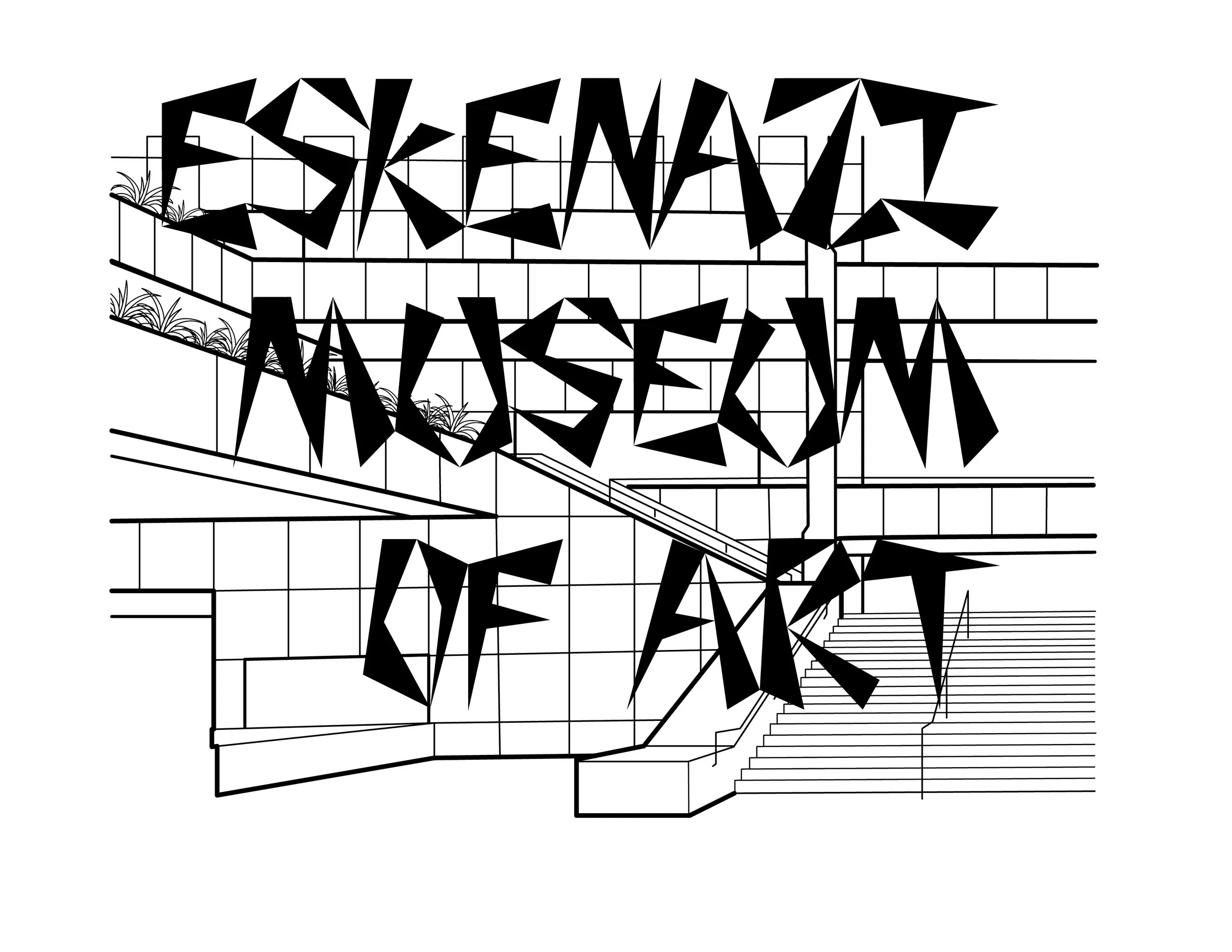
The two basic versions of my designs in Black/White before combining them. I chose to portray the interior of the museum because it was what made me first fall in love with the Eskenazi Museum. The sharp geometric letterforms were a result of wanting to emulate how the building has “no 90-degree angles except where structurally-necessary" (Visit Bloomington).
Layouts
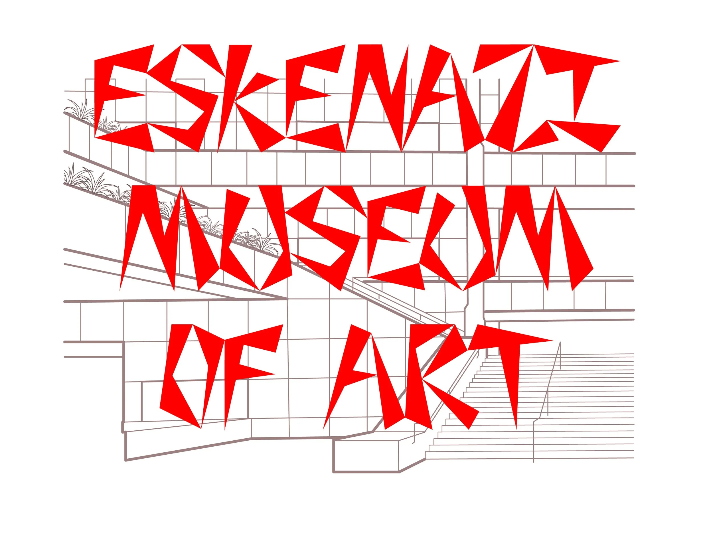
At this stage the interior graphic along with the typography are somewhat difficult to read, but I am focusing on composition before changing either elements. I went with right aligned and smaller text to highlight the sharp angles depicted prominently on the left side of the museums interior.
I was debating between going with a more of a architectural direction or a typographical direction, so I decided to explore both options.
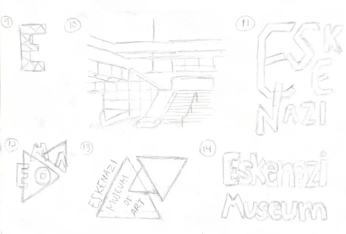
This iteration is more simple and I considered red for the color, but thought that may be too on the nose to IU’s branding.
I was inspired by the glass ceiling and explored the creation of a overlapping light effect. Color wise I wanted to implement multiple colors.
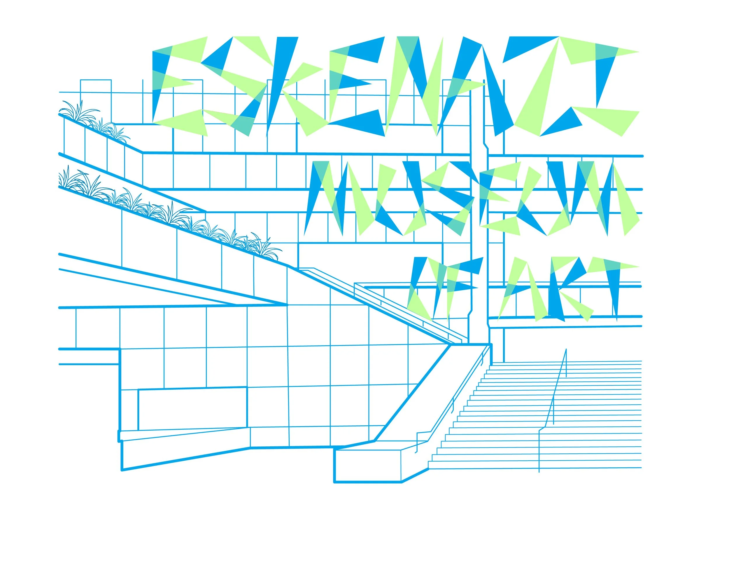
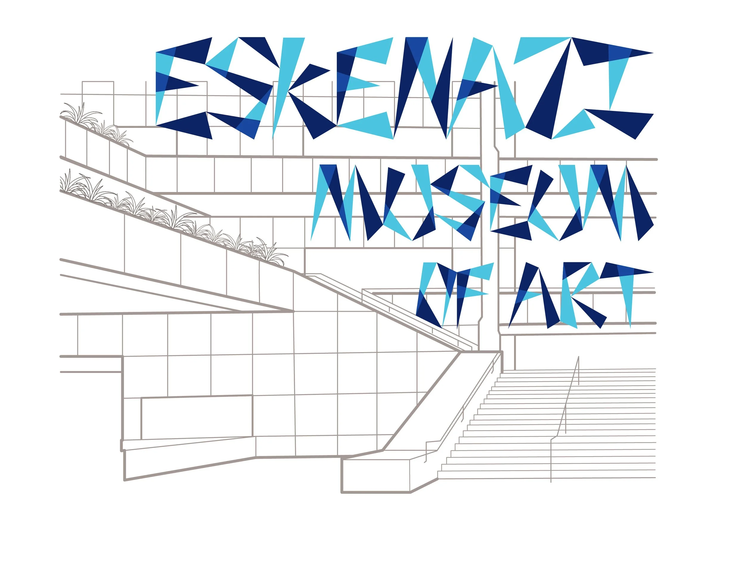
Design Iterations
I tried out a variety of color schemes, some that I liked more than others. I thought that a monochromatic color scheme worked better for legibility of the letters. In some of the color variations I did not find a good balance between the letters and interior graphic so it all clashed together.
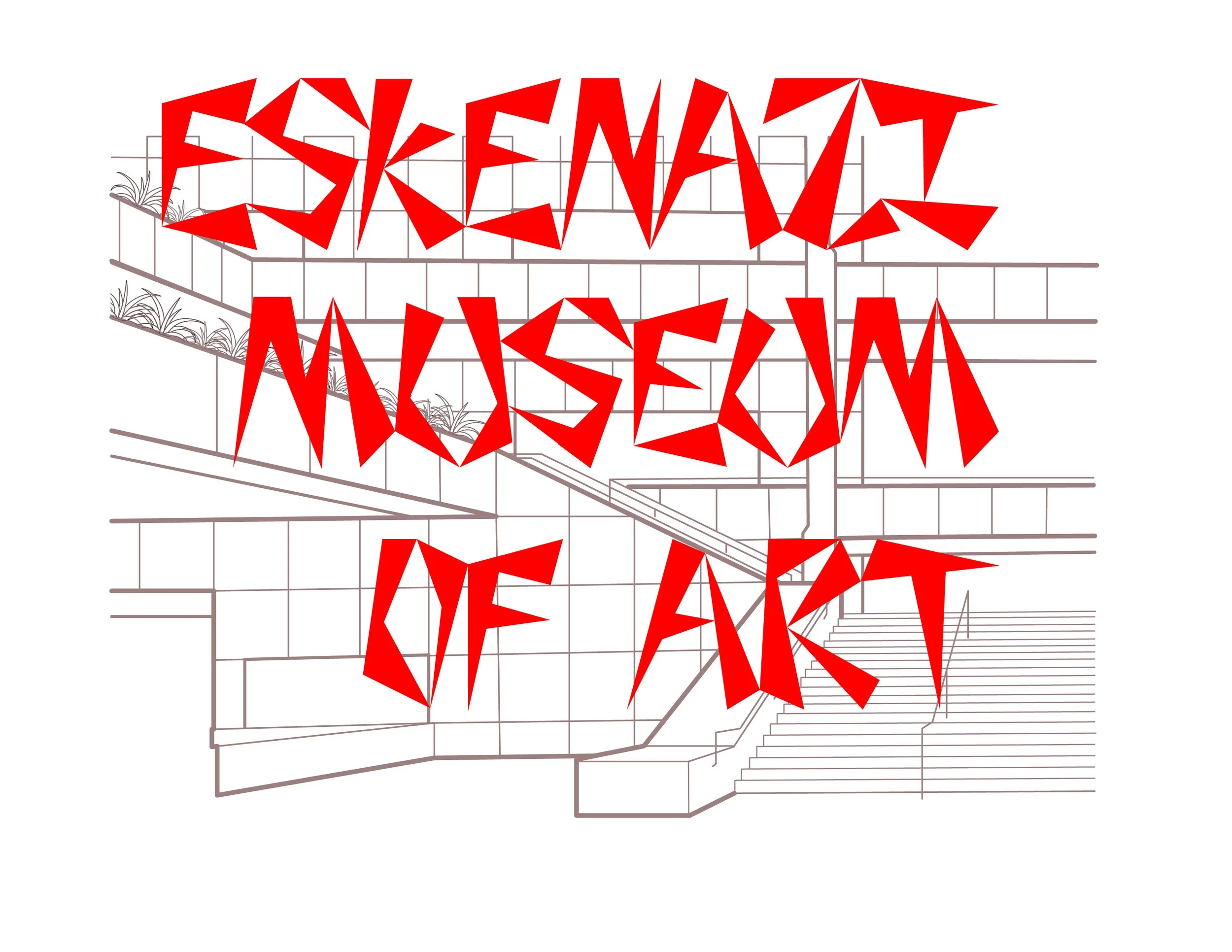
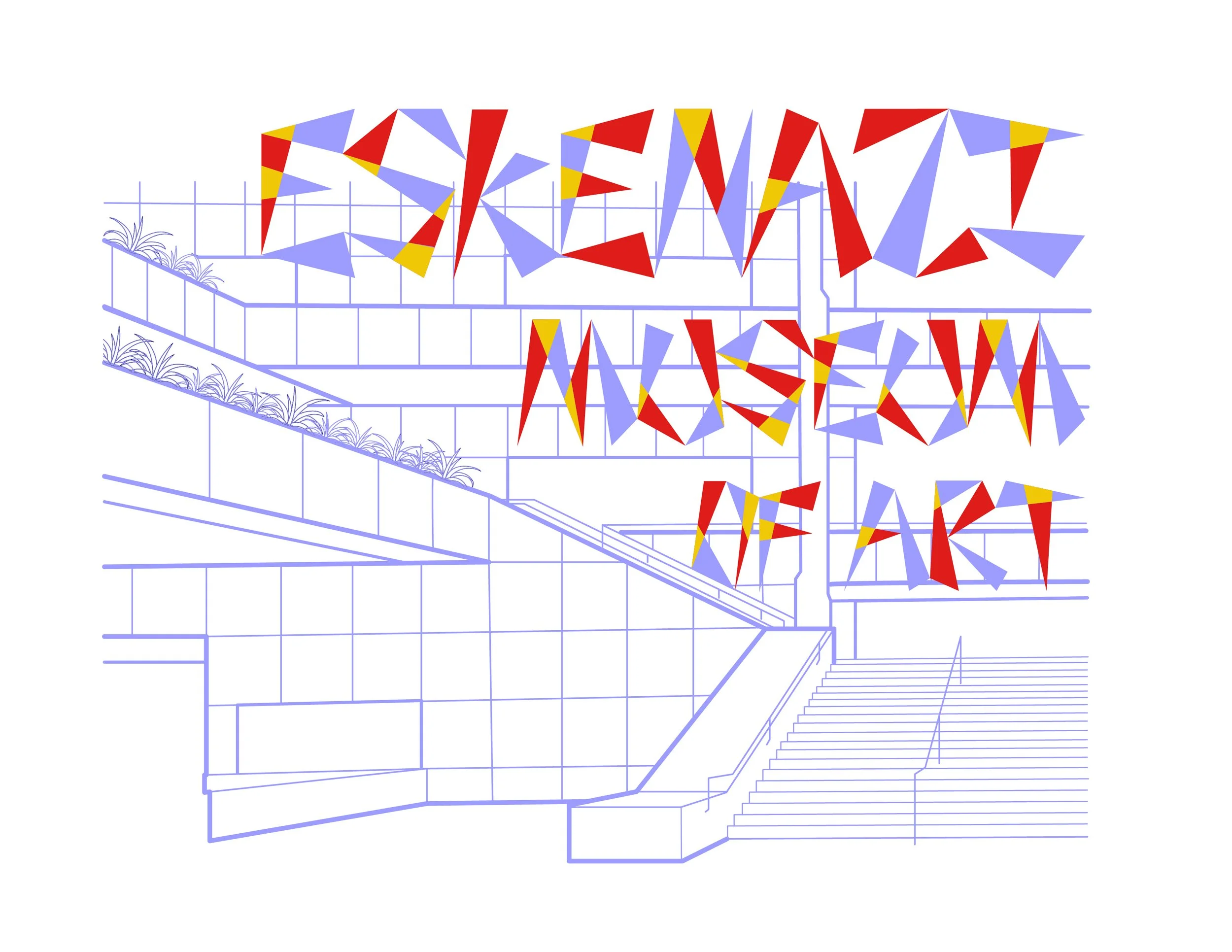
My most successful of the 3 color variations is the red, blue, and yellow color scheme because I paired it with a neutral colored interior graphic so the letters would standout. I ultimately did not chose that exact iteration because I found the letters appeared too busy.
There are elements from of a few of these iterations that made it into my final designs such as having monochromatic letters and the red, blue, yellow color scheme.
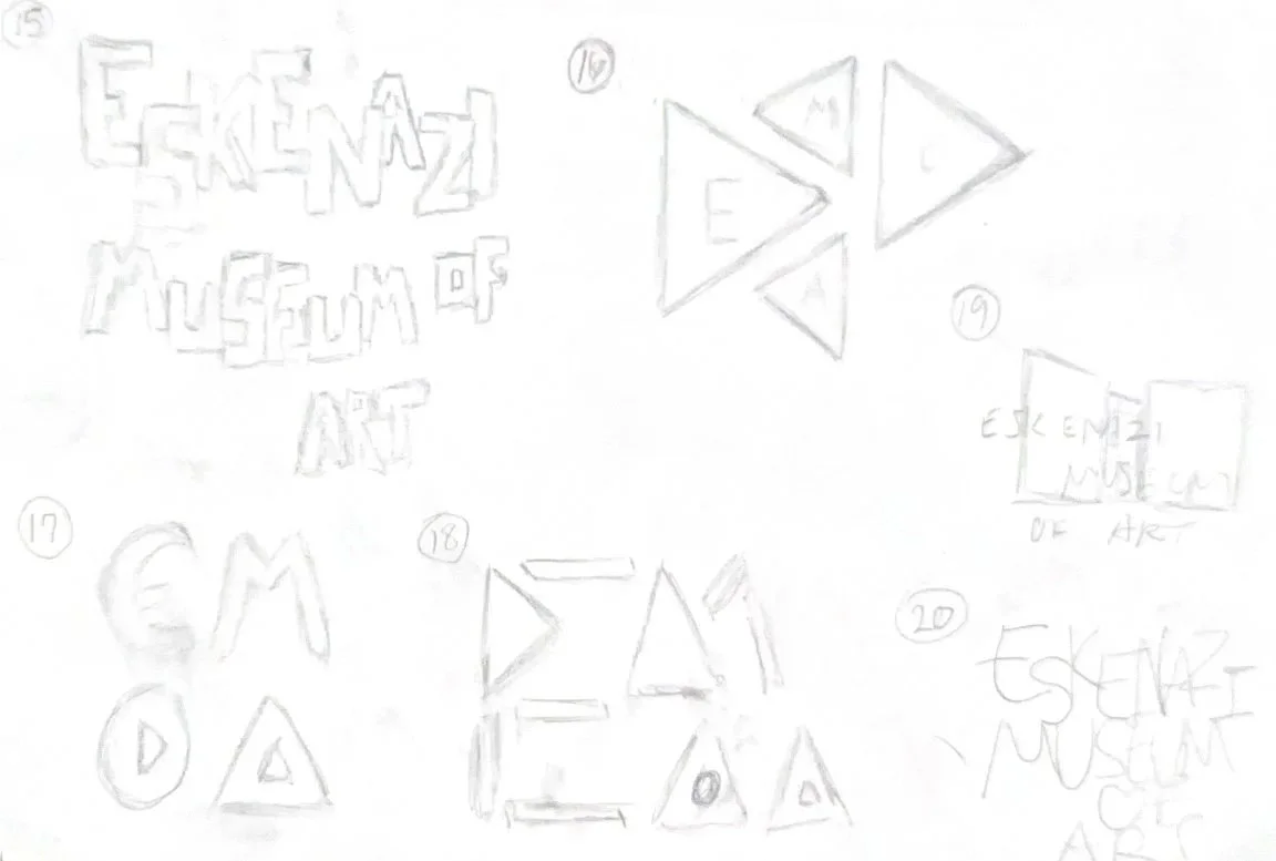
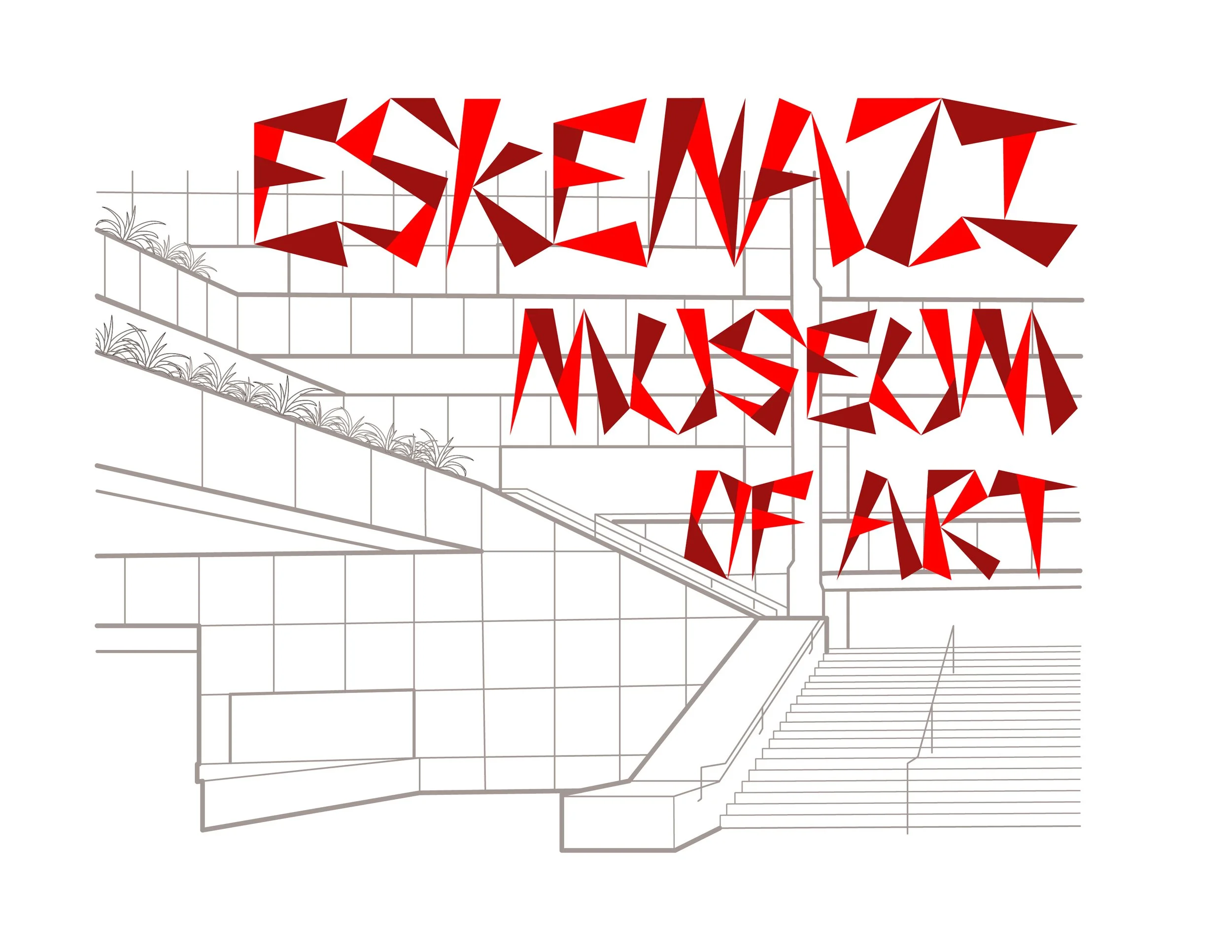
Final Implementation
Concept
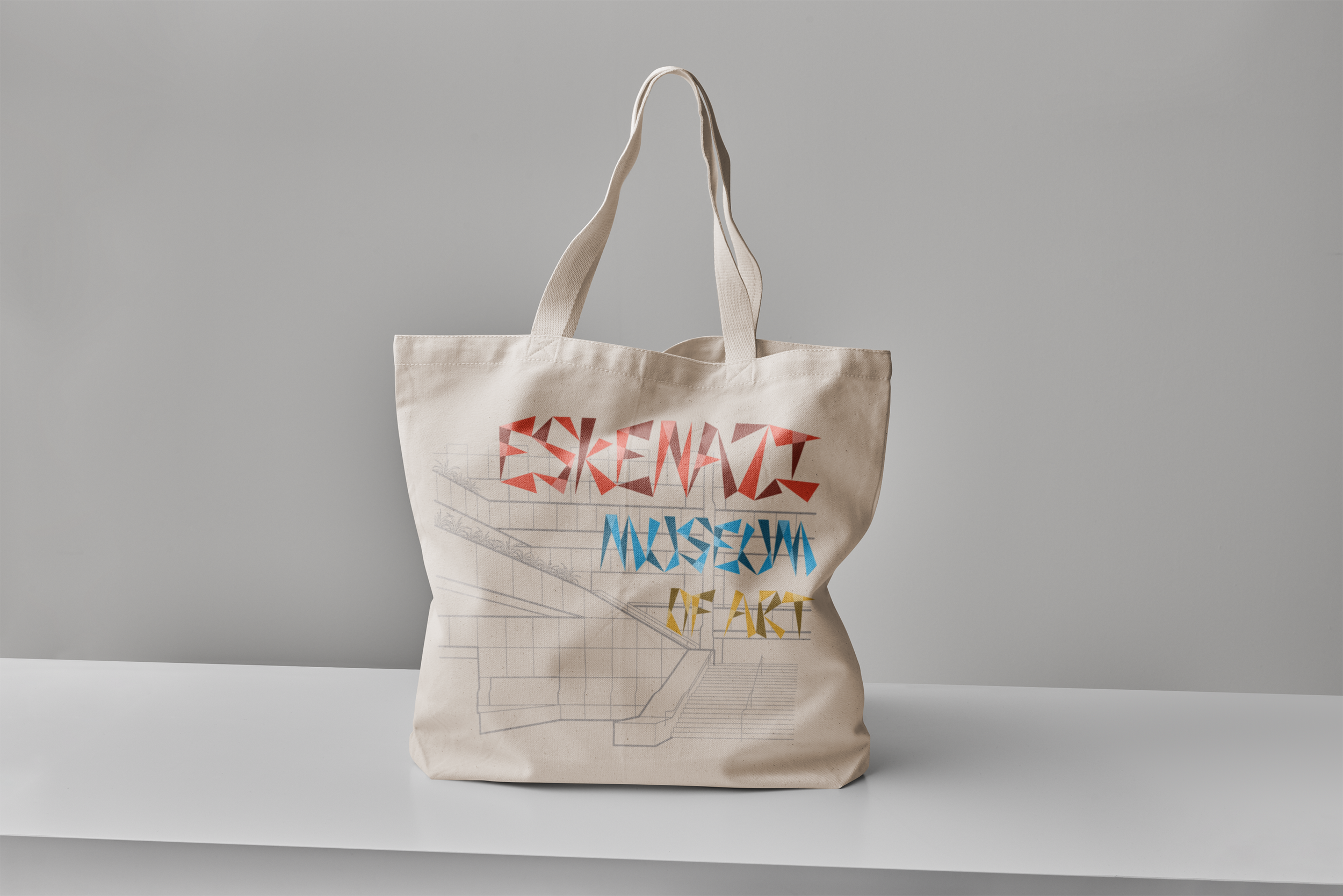
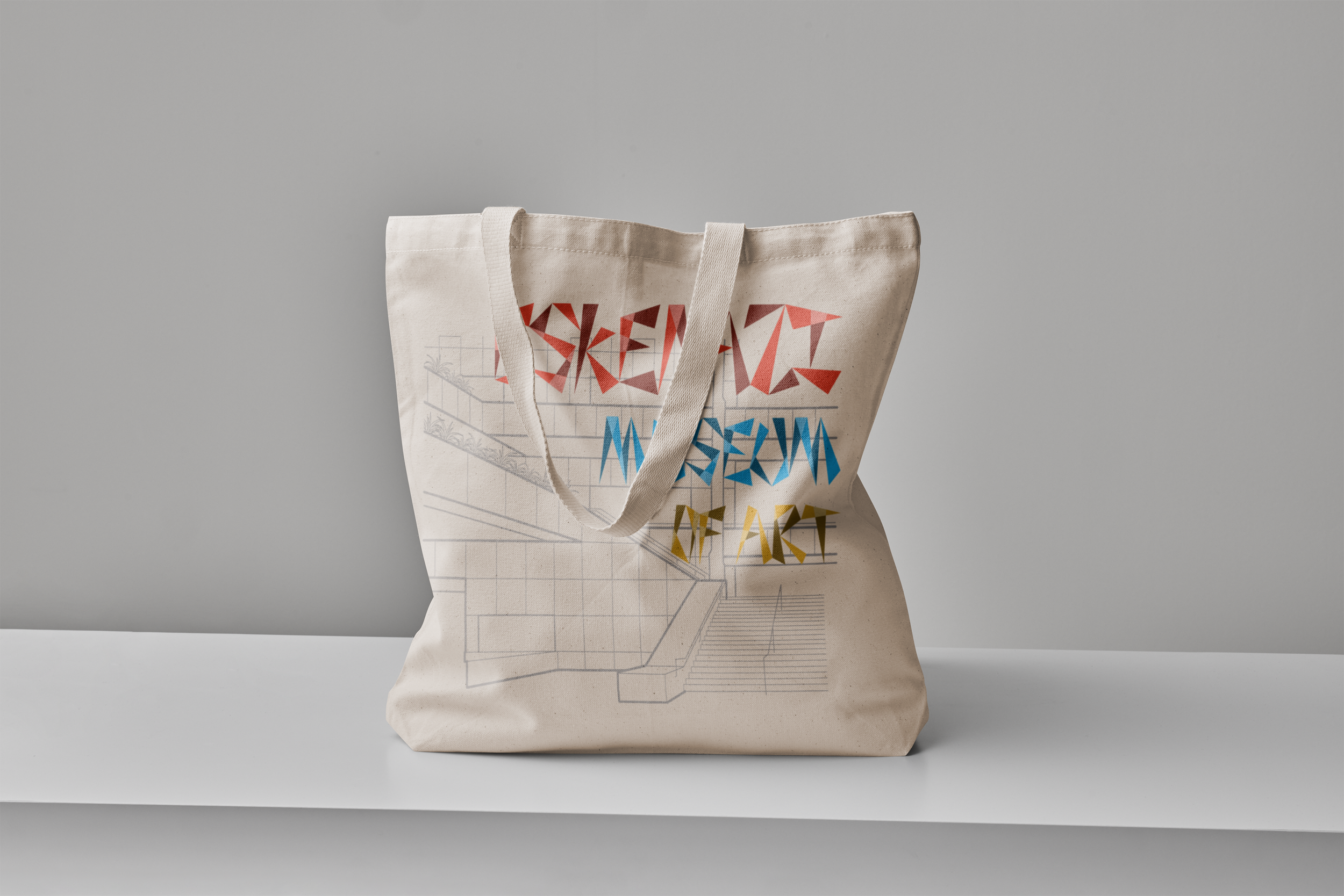
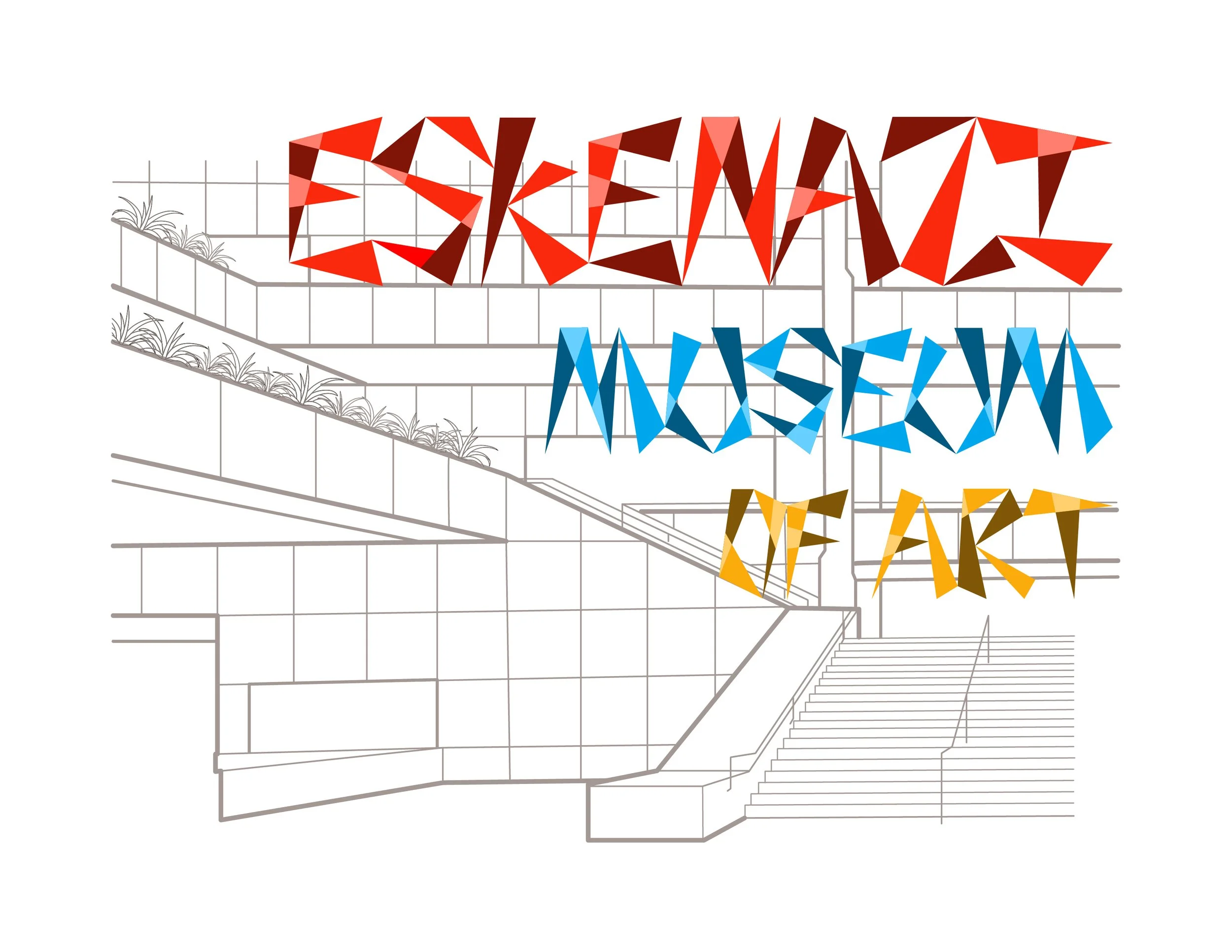
We aim to capture the unique architecture of the Eskenazi Museum of Art through a series of tote bags. The designs capture the essence of the geometric forms of the museum. By incorporating bold typography and eye catching designs we hope to appeal to students, Bloomington locals, and visitors alike.
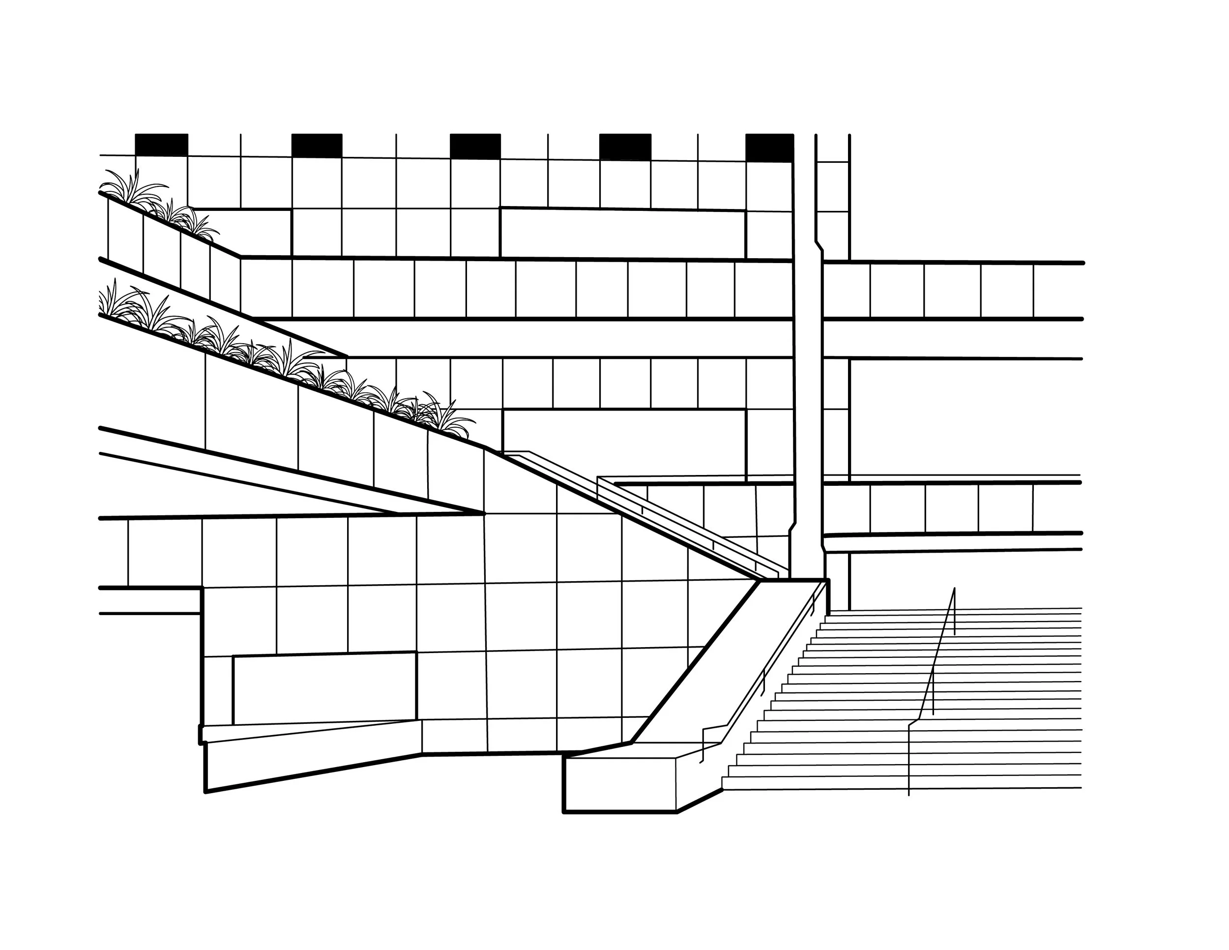
Final Design
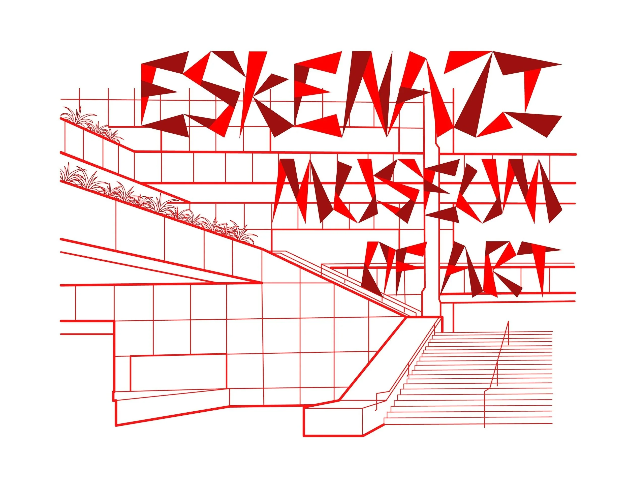
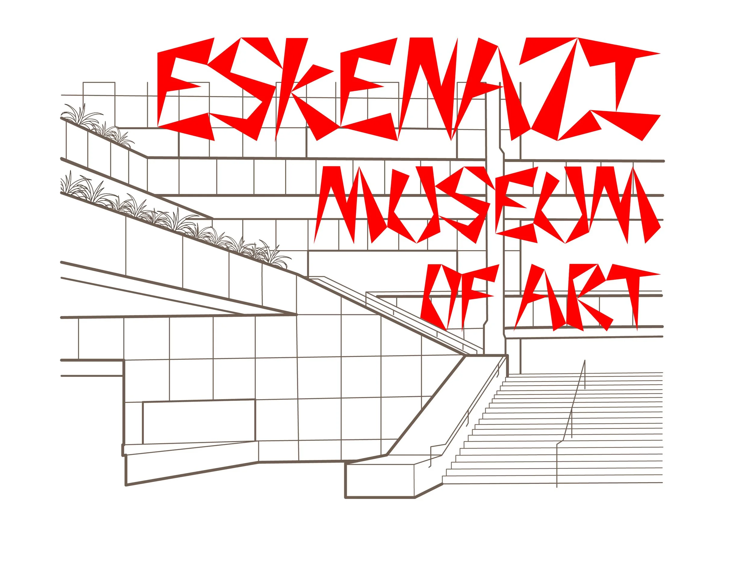
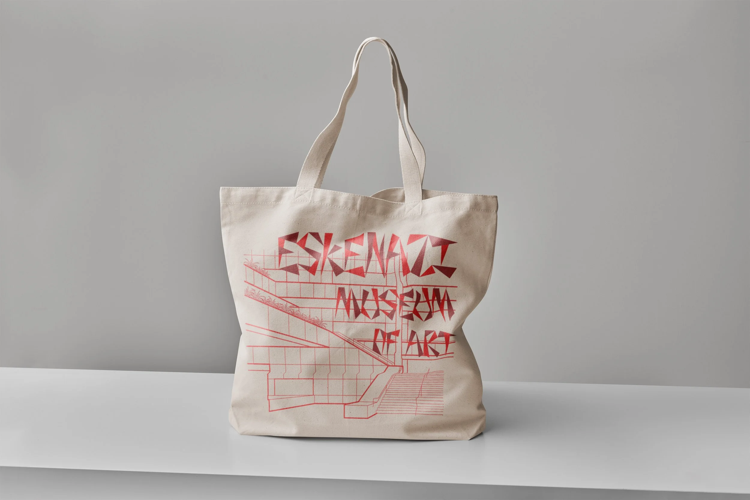
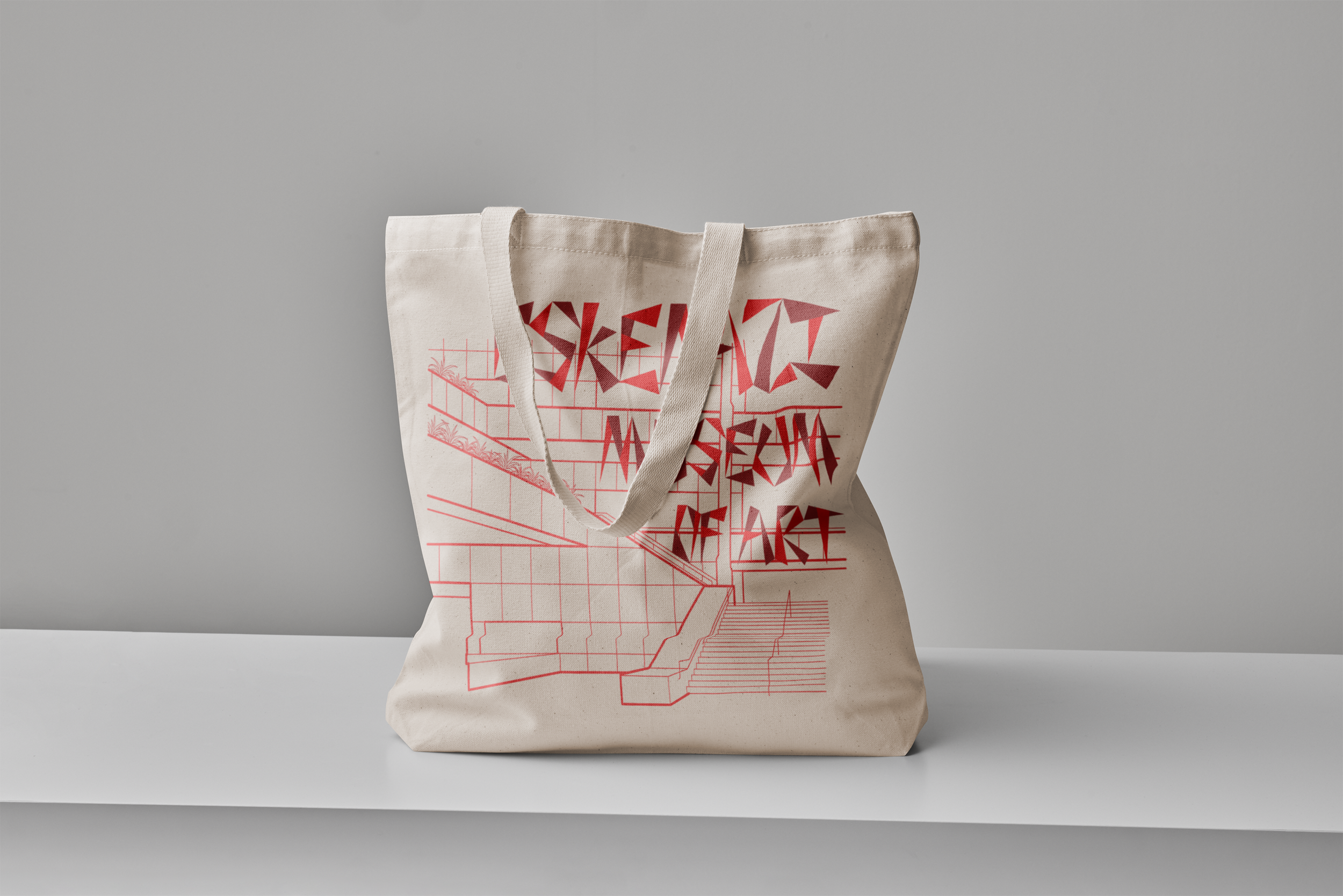
The red captures the branding of the Eskenazi Art Museum and the monochromatic 2 shade design would make it easier to produce. While the tote bag itself is simple, the red color and bold geometric forms makes it pop.
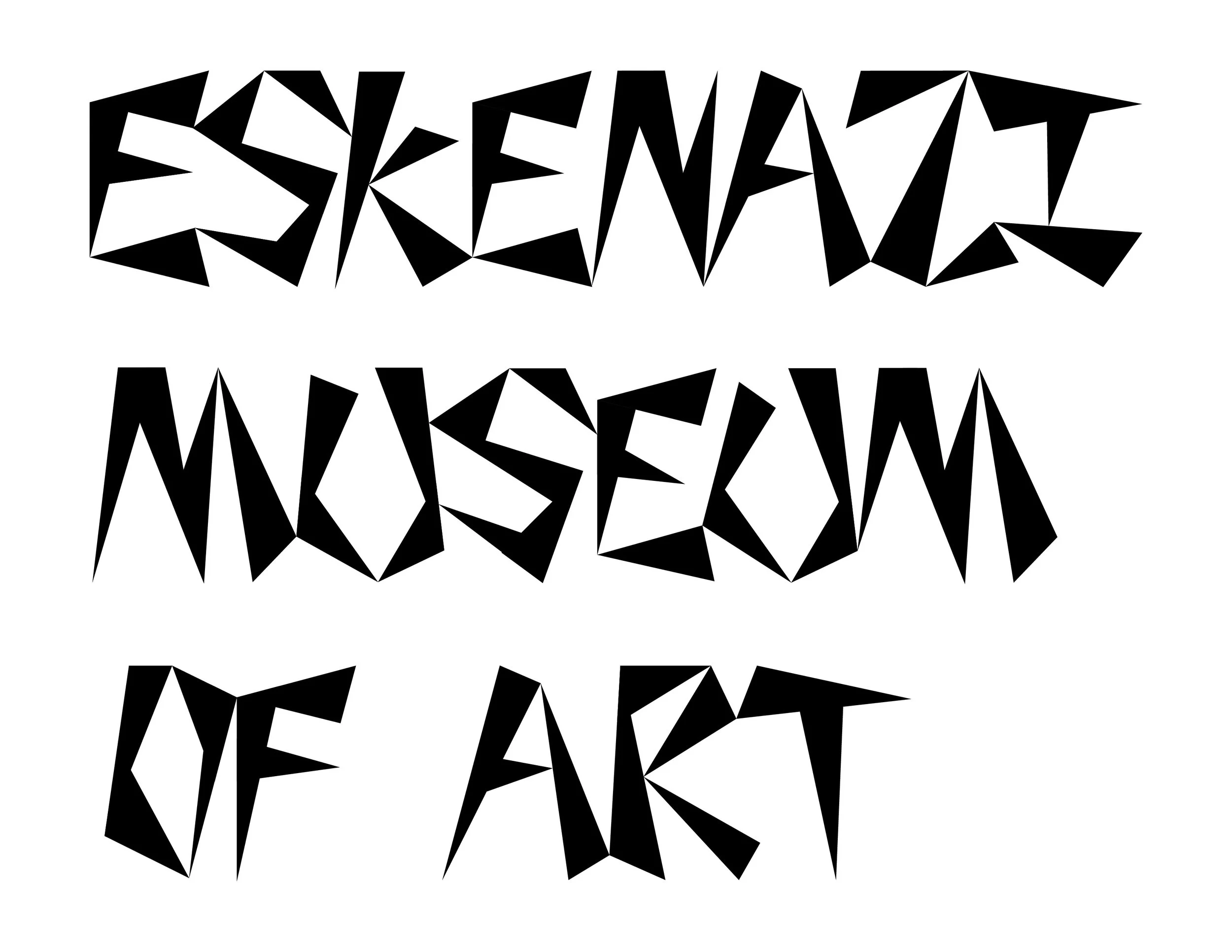
Alternate Final Design
I chose this as my alternate design because I believe the design works better as a postcard or print than a tote bag. In addition the use of more colors means it would cost more to produce. With this design the colors capture the creative energy of the art museum as well a sort of an overlapping light effect, which refers back to the glass ceiling.
Results
My final design as well as my alternate design along with designs by my 3 group members were presented to the museum representatives. For context, I was unable to present my work in person to them to explain the rationale behind my design. Two members of my group was were chosen by the museum representatives to have their work produced. I received feedback that they liked my design, but not the typography. My takeaway is that sometimes the design may not suit what the client wants, despite best efforts.
References
Something